| | |
| | |
| | | The Visualizer is a powerful tool that can be used to graph a set of objects from the Relations Tab, a worklist, Cohort Analysis, Power Filter, Trend Analysis, or Comparative Analytics. To open the Visualizer from any of these screens, right-click on the bottom-most object in the list of objects to be visualized and select ‘Visualizer - top X’. Note that no less than 10 and no more than 50 objects can be loaded into the Visualizer at any given time.
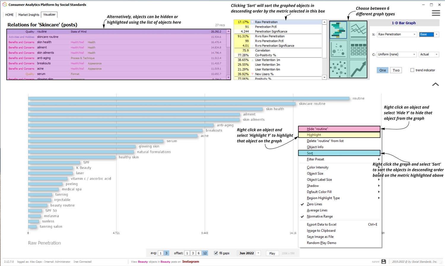
Once open, select between 6 different graph types depending on the desired insights (image 1). Certain graph types (like the 1D-bar graph below) allow for object sorting. To sort an object by a specific metric, select that metric at the top of the Visualizer screen, right-click on the graph, and select ‘Sort’. Objects can also be highlighted or hidden from the graph by right-clicking on the object and selecting the appropriate option.
| |  | | |
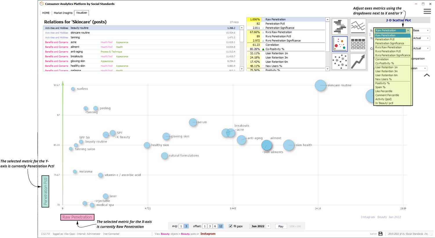
To adjust the metric of an axis, use the drop-down next to the respective axis label at the top right of the window (image 2).
| |  | | |
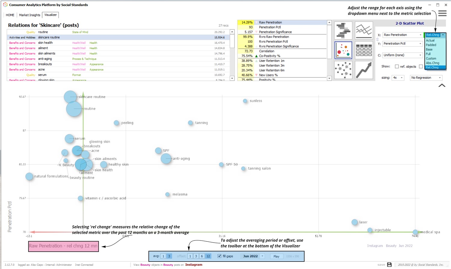
The range (or minimum/maximum values) of an axis can also be adjusted using the drop-down menu to the right of the metric adjustment drop-down (image 3). In the example below, the x-axis is displaying the Raw Penetration (metric) and its relative change over the past year (which is defining the range). When measuring a change, adjust how the data is averaged, how long of a period it is measured over, or the month the data ends on using the toolbar at the bottom of the screen.
| |  | | |
Similar to other screens in the platform, data from the Visualizer can be exported to an Excel file or saved as a separate file to be stored or shared. In order to do so, right-click anywhere on the graph and select the appropriate option (image 4). | | 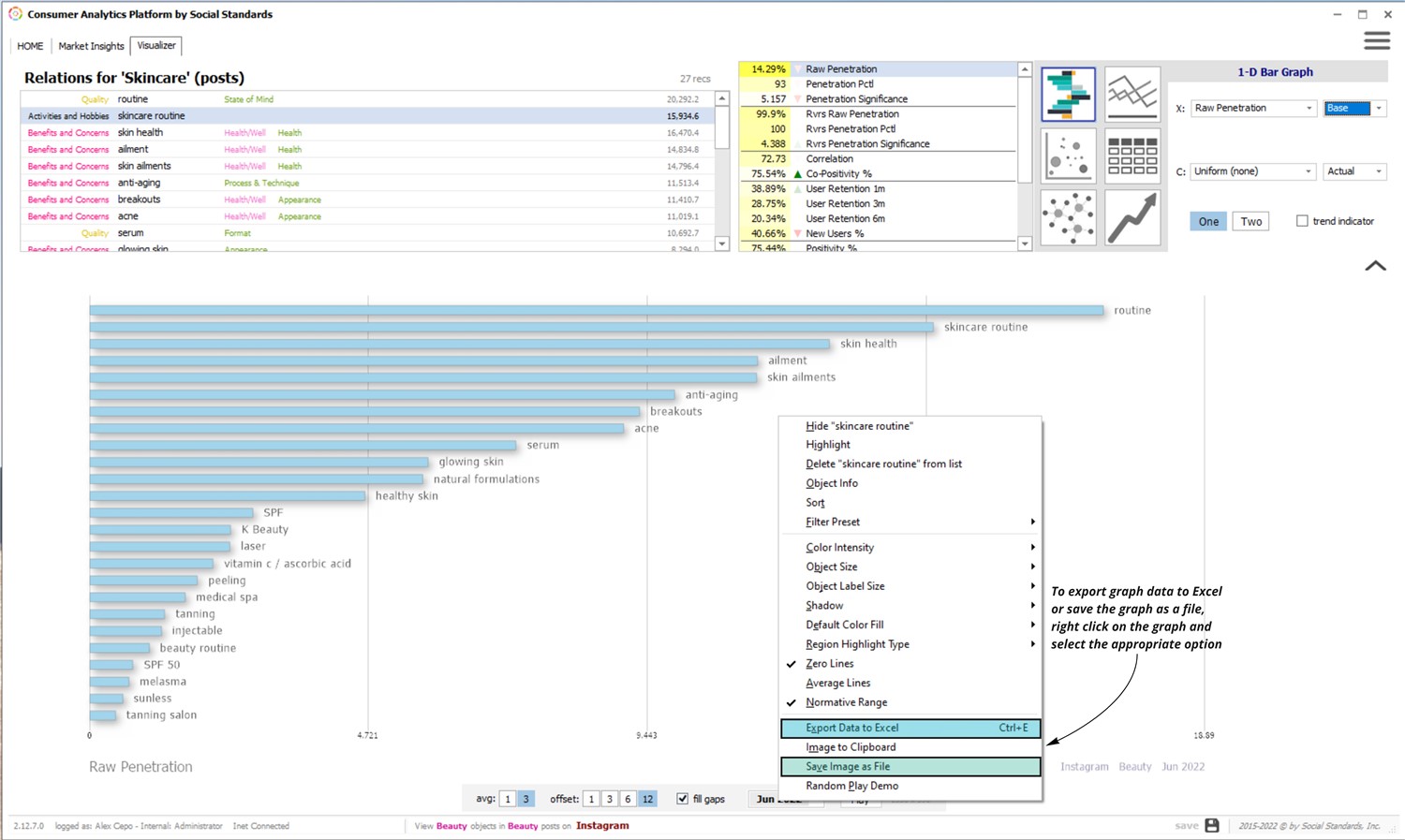 | | | | | |
